xChangePlus
interface

Our client, a real estate startup from Chicago, felt that the design of his product had stopped him from entering the market.
The need for change escalated when an investor made a proposal, in which he emphasized that the product’s design had to improve in under 3 months. The client had already made several unsuccessful attempts to work with digital agencies, especially struggling to find a team with expertise in both design and front-end development ready to jump-start with a minimal brief. As a first step, we offered to


The client was so satisfied with the results that trusted us with the full rebranding, the interface re-design as well a marketing website design and front-end development.
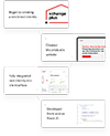
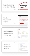
As a result we were able to launch the redesigned platform in under 3 months


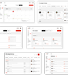
MVP. The startup came to us after the MVP launch. Functionality and an unusual interface led to the first investments.
Dashboard. Main page is a huge table with all company’s deals. The client was inspired by trade terminals that allow to see problematic deals based on several criteria.
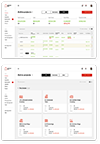
For smaller companies we developed an alternative dashboard with deals displayed as cards. Here you can focus only on the important things.
For smaller companies we developed an alternative dashboard with deals displayed as cards. Here you can focus only on the important things.
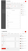
Deal detalization. Detailed information about hte project, team tasks, documents, mini-chat and notes.

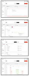
Timeline. For tasks and dedlines we created a few different reports: daily, weekly, monthly and annualy.

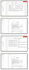
Online document editor. Users can create specifications, validate and sign documents and generate reports right in the interface.

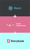
Front-end. Together with the startup’s team we developed the front-end on React JS. This approach provided higher speed and better scalability of the service.

